How to design a basic responsive Navbar with logo was a very simple example following these steps.
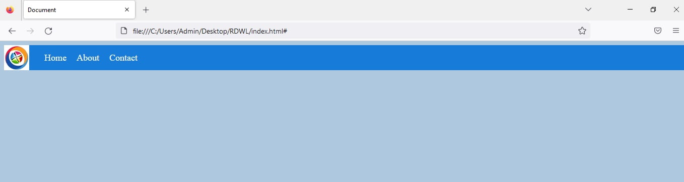
Table of Contents
To design a responsive navbar with a logo, you can follow these steps:
- Create a container element for the navbar and add a logo image inside of it.
- Create a list of links for the navbar. These can be placed inside an
ulelement. - Add some styles to the navbar to make it look good. You can use CSS to change the font, color, and size of the text, and add a background color or image to the navbar.
- Make the navbar responsive by using media queries. You can use media queries to change the layout of the navbar at different screen sizes. For example, you can stack the links vertically on small screens, and display them horizontally on larger screens.
- Test the navbar on different devices to ensure it looks and works as expected.
Here’s an example of a basic responsive navbar with logo using HTML and CSS:
<!DOCTYPE html>
<html lang="en">

<head>
    <meta charset="UTF-8">
    <meta http-equiv="X-UA-Compatible" content="IE=edge">
    <meta name="viewport" content="width=device-width, initial-scale=1.0">
    <title>Document</title>
</head>

<body style="background-color:#AEC8E0 ">
    <nav style="background-color:#177CD9 ">
        <img src="logo.png" alt="Logo" id="logo">
        <ul>
            <li><a href="#">Home</a></li>
            <li><a href="#">About</a></li>
            <li><a href="#">Contact</a></li>
        </ul>
    </nav>

    <style>
        nav {
            display: flex;
            align-items: center;
            background-color: #333;
        }

        #logo {
            height: 50px;
            margin-right: 20px;
        }

        ul {
            list-style: none;
            margin: 0;
            padding: 0;
            display: flex;
        }

        li {
            margin: 0 10px;
        }

        a {
            color: #fff;
            text-decoration: none;
            font-size: 18px;
        }

        a:hover {
            color: #ccc;
        }
    </style>

</body>

</html>
This navbar will display the logo and links horizontally on larger screens, and stack the links vertically on smaller screens. You can customize the styles and layout to meet your specific needs.
Read more.
- The Ultimate Guide to the Top 10 Java Frameworks for 2024.

- A Comprehensive Guide to Using javascript:location.reload(true) in Web Development
- PHP explode Multiple Separators: A Comprehensive Guide.

- Copy Constructor in Java: A Complete Guide

- 50 Ultimate PHP Project Topics to Elevate Your Development Skills.